Kids Help Phone: Re-Branding or Brand-Killing
Exploring the re-branding of Kids Help Phone and what it means for marketing and communication professionals
Exploring the impact misguided re-branding exercises can have on non-profits
This past weekend I happened to come across a news article about the national youth helpline, Kids Help Phone. The story was just a regular sort of announcement about a new service they were offering but it was how I became aware of the fact that the organization underwent a re-brand back in 2022.
For anyone unfamiliar with what Kids Help Phone does, they run 24/7 phone and text services for youth dealing with mental health crises and have no one available to speak with. This is a service that no one would argue is very important especially considering the rising rates of youth suicide and other serious mental illness.
My thoughts on this have almost nothing to do with the actual organization and the work they do, but rather the larger picture of how non-profits – particularly healthcare-adjacent ones – are in a losing battle when it comes to modern marketing and branding.
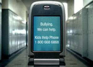
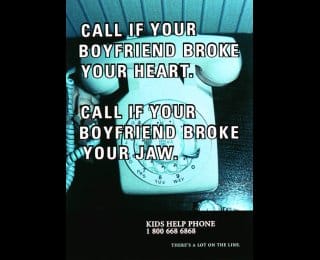
For a bit of context to anyone who did not attend a high-school or post-secondary school in canada and was therefore not bombarded with Kids Help Phone posters in every bathroom, this is what their "brand" looked like for years, if not decades.
Old-School Kids Help Phone
Below are a few samples of what I will call the "old school" designs of Kids Help Phone posters and branding. These are the styles of posters that were around before I entered high-school and continued being used well into my time studying and then working in post-secondary institutions.
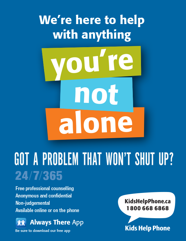
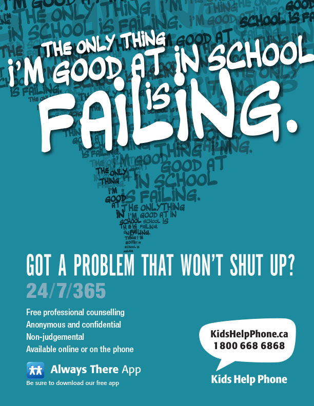
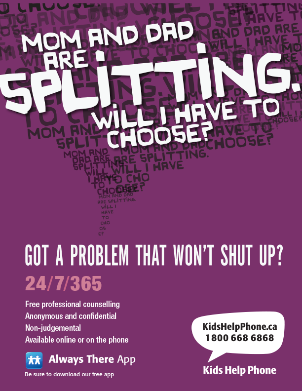
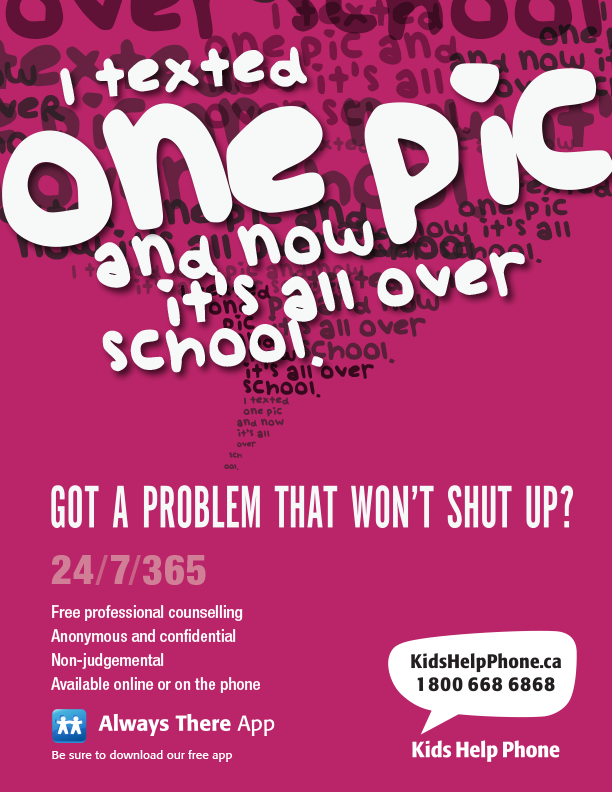
Posters from the "Got A Problem That Won't Shut Up?" campaign
While there are several design choices that I would adjust if I had to redesign these posters for present-day use, overall there is honestly little "wrong" with them. They have a strong identity that makes it clear they all come from the same organization while maintaining a level of personality or interest that I believe is essential when making a design for anything targeted at teens or a design that involves a heavy topic – both of which being true for Kids Help Phone.
Even the logo of the organization didn't have the issue many phone-line services faced with the dawn of text-based support technology – using traditional phone imagery in their logo. With a lucky, or perhaps a very forward thinking, decision they went with a simple speech bubble which requires no change to be understood to include text messaging as well as a traditional phone call.
The organization also did regularly take freedom with individual campaigns and branched out with their designs, as shown in a few samples below.

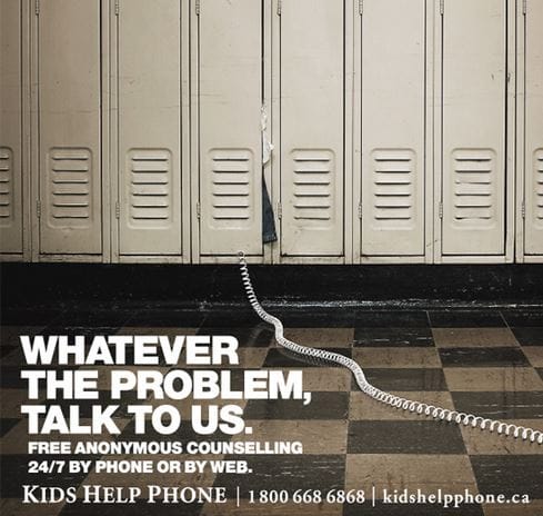
Various screenshots from old-school ads and campaigns from Kids Help Phone
Despite there being no reason that I can find the organization decided they needed to undergo a re-brand in 2017.
A huge thank you to Danielle Bartel for having the graphics available on her website (https://daniellebartel.com/kids-help-phone-rebrand/) and a quick disclaimer: I have no hate for the designers behind this re-brand and nor should you. As someone who has been a designer receiving re-branding decisions from executives that I would never have chosen to do myself, I don't believe anyone is at fault on the design team. In fact if I ignore the context I'd say the designs are very well made; the issue is totally separate from the quality of the re-branding. My issue lies with whoever decided a re-branding was necessary in the first place, and the decision to make the re-branding so comprehensive.
Minimalism Strikes Again
Their 2017 re-brand heavily leaned into the minimal design trend that took the marketing world by storm in the 2010s. I've included some of the new brand assets below, thank you again to Danielle Bartel for publishing these.
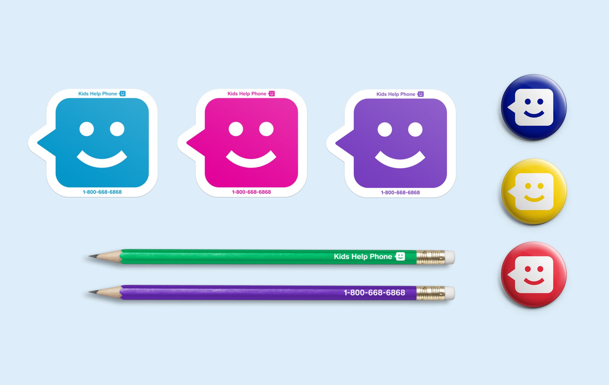
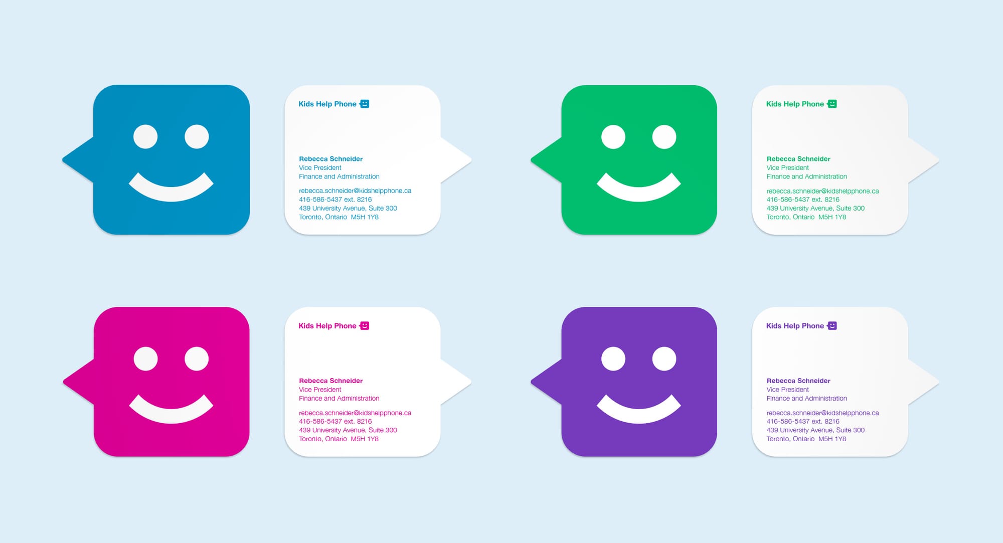
Samples of the new branding and logo printed on various products
The 2017 re-branding echoes the pattern many companies and organizations have taken in the 2010s: flattening and minimizing their logos and brand identity into the simplest derivation possible. I'm not debating the usefulness or functionality of this trend in general, because for many businesses there are very clear reasons to do exactly this. Much of it comes from minimal logos and graphics being easily re-sizable when made using vector graphics (SVG and EPS files for example) which makes their logos and branding show up pretty much the same whether on a Times Square billboard or on a tiny phone screen, and everything in between.
There are also many companies that have simply gotten so large and abstracted through buyouts and complex ownership setups that their logo doesn't really matter in terms of consumers recognizing it. For example, the "Frito Lay" company could easily change their logo every 6 months and next to no one would notice, because the main logo and imagery people see on the products wouldn't change - whether its Lays Chips, Doritos Chips, or Smartfood Popcorn. This is not the case for an organization like Kids Help Phone.
Given the requirements the design team was given, I have to say I think that this re-brand does the best it can. It is hard to achieve the minimal look without sacrificing all of the brand's individuality or personality but the brand assets strike what I feel is a decent balance.
I still find myself asking "what does this re-brand really accomplish?" because I strongly believe that not having updated a logo in several years is one of the worst reasons companies undergo re-branding, especially if that involves scrapping the logo for an entirely new one. My point however, is not to tear this re-brand apart because not only do I believe it could have been much worse and in 2022 that belief was proven correct.
How to Kill a Brand
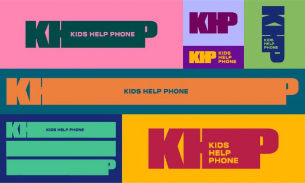
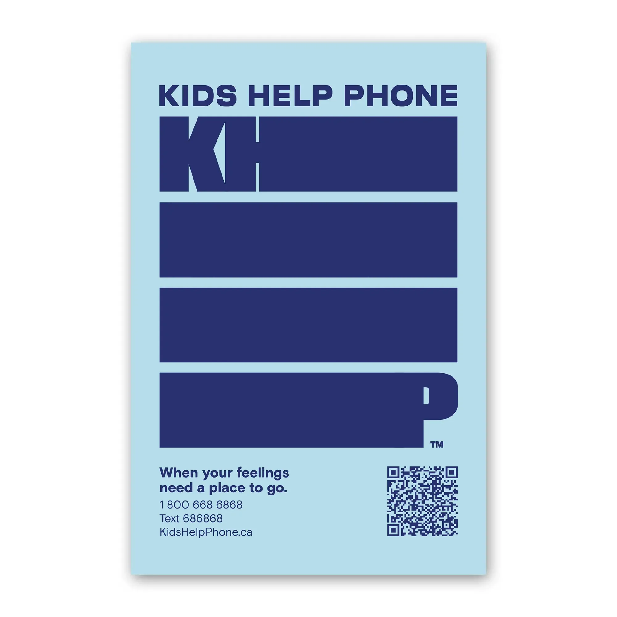
If I had an issue with their 2017 re-brand, I have a million issues with whatever you might call what was done to the Kids Help Phone brand in 2022. From what I can tell (based on limited information online) the 2017 re-branding was completed by freelance or indie designers. The 2022 project however, was worked on by McCann Canada which is "an American global advertising agency network" according to Wikipedia, and is part of a gigantic multi-national corporation known as The Interpublic Group of Companies Inc. or IPG which is one of the top 4 largest advertising agencies in the world, per the New York Times.
To put it simply, an enormous American-owned marketing giant that serves a similar role in the marketing world that the McKinsey company serves in the consulting sphere was put in charge of a Canadian mental health non-profit's re-branding. Going from a small team of local, likely underpaid, designers to hiring a massive agency like McCann to handle a rebrand a mere 5 years after their previous one raises enough red flags on its own, but unfortunately things only get worse from here.
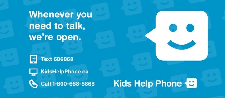
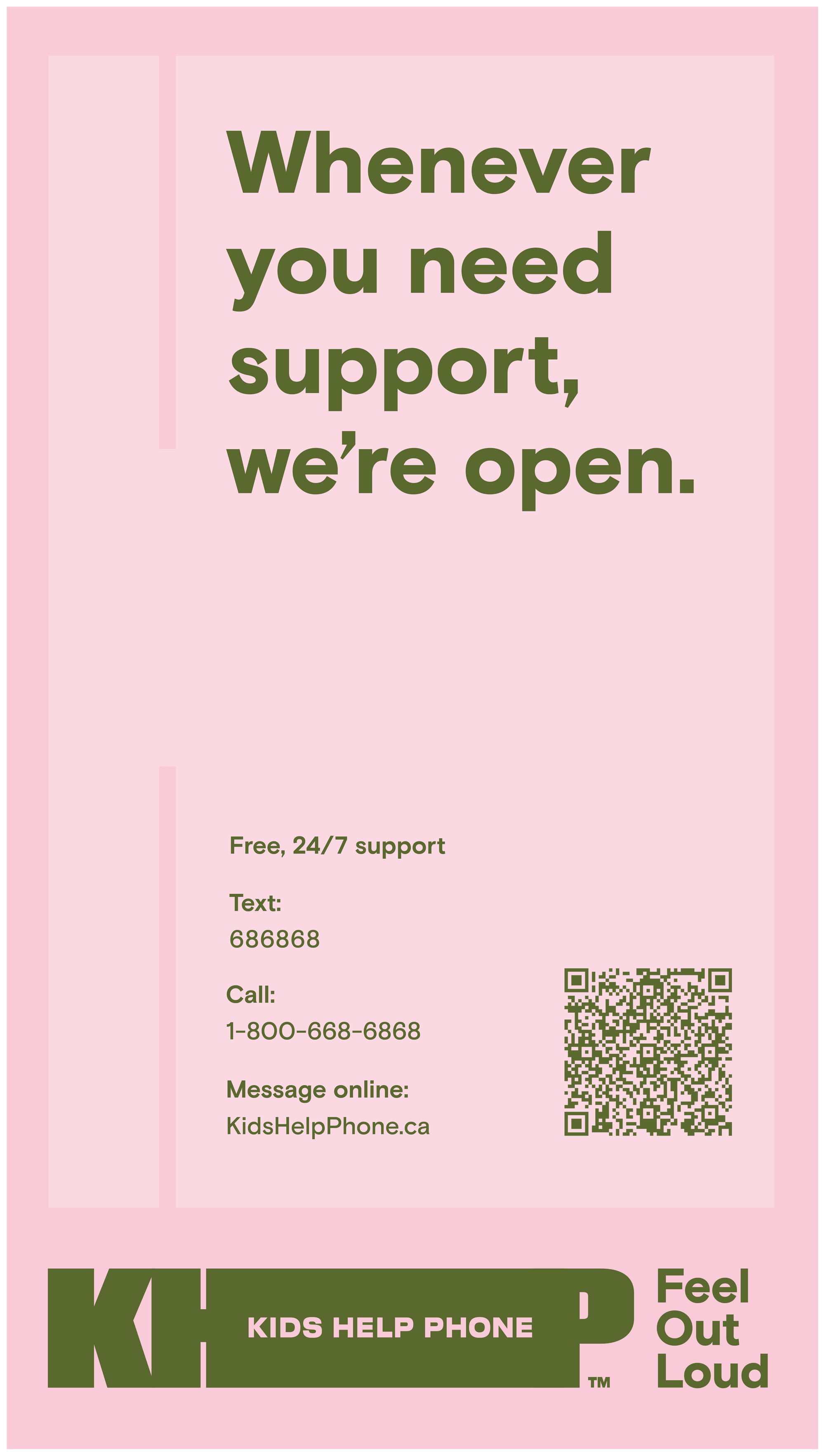
An promotional overview of the re-brand
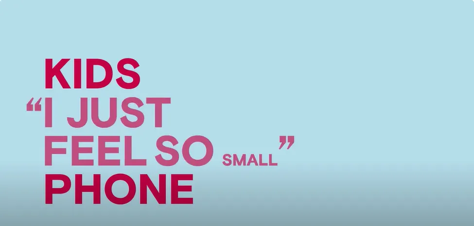
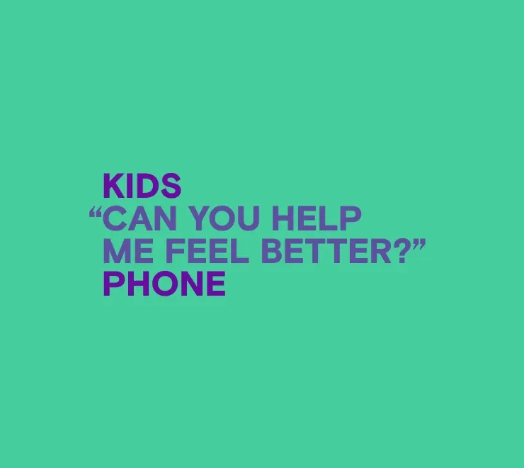
Let me get the positive out of the way: if we again ignore all the context that this is a non-profit aiming to save lives and make mental health issues easier for youth to handle and process, then I'd probably give the designers a 9 out of 10. Solely focusing on the KPIs that a shareholder might care about in a corporation this would deliver many positive outcomes; the versatility of the logo for all types of merchandise, the mix of bold colours and flat-minimalism make it very much "in style", and the use of the distorted or modified text in place of imagery (like the previously used chat bubbles) is also a trending design feature these days.
For a marketing class assignment this re-brand hits all the marks, but for the real world where I believe the marketing team should not entirely divorced from the context of the service they are developing materials for I cannot see how this was ever proposed, let alone approved.
I will come back to the specific context of designing for a mental health initiative like Kids Help Phone later on because I mainly have personal opinion-based critiques on that, but first I want to quickly cover a few of the simpler and more straightforward issues that I see here.
First, we revisit what the purpose of a re-brand is. If the purpose is to refresh the brand because people have gotten bored with the familiar (which I believe is very difficult to prove in any case and is often just fatigue among the design team having to work with the same guidelines over time) then changing every recognizable aspect of the brand makes no sense. There are plenty of ways brands do refreshes that don't sacrifice all of their built-up brand recognition; changing their default fonts, adding new brand colours, or even slight modifications to the logo are just a few of the ways this can be done.
It genuinely took me about 5 minutes into reading the story that came across my feed about Kids Help Phone to realize it was not referring to a similar service in a different country, but was in fact the same organization I had spent years referring students to and running mental health events that featured their resources. It was easier for me to believe it was a foreign company with the same name than it was for me to believe they had made such a drastic departure from their previous identity.
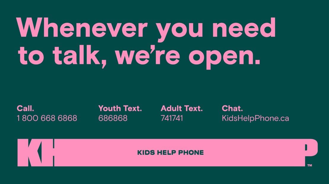
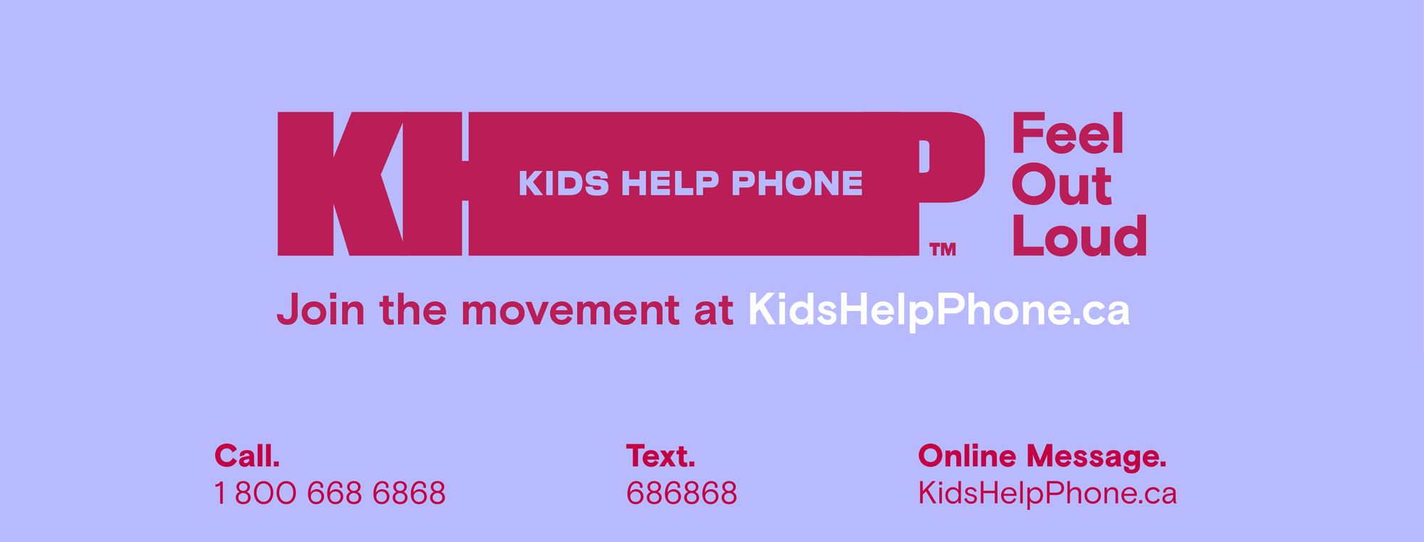
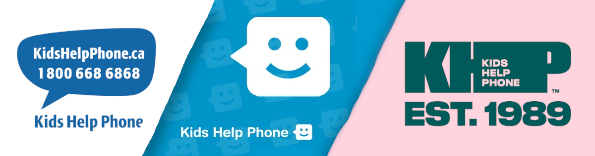
Several web banners used by Kids Help Phone following their 2022 rebrand
The other potential reason for a re-brand has to do with an intentional departure from a previous identity, where the re-branding is meant to reflect a larger change occurring within the organization. This could be situations like a re-brand that I got to work on in my role at the Toronto Metropolitan Students' Union – we had to re-brand because the university was undergoing a name change process as part of reconciliation and recognizing the school's former namesake, Egerton Ryerson, played a large role in the establishment of the Residential School System that stole, displaced, and murdered countless Indigenous children up until the late 1990s. Nothing of the sort was the case with Kids Help Phone however, they still offer the same services they did when I first heard of them.
To further show how this re-brand fails when evaluating it in reality, if we look at some of the traditional measures of success we can see how quickly they lose all meaning. With the versatility of the logo for use on all types of merchandise, how much value does that actually have to an organization like this? Unless high school has rapidly evolved since I attended almost 10 years ago into a utopia where kids are fully accepting of differences and never bully the "outcasts", I can think of few things worse than going in to school with a Kids Help Phone branded tote bag or sweater. I would have sooner written "ask to see my self harm scars" on my forehead than worn shoes or hats with the Kids Help Phone logo on them.
The standard materials that organizations hand out like pencils, pens, and sticky notes are great because they are very impersonal. Every student gets tons of branded stationery and no one is looking at the sticky note or pencil you use and assuming it speaks to an important part of who you are. The same is not true at all for clothing and other wearable merchandise; these are more personal items that often communicate something about how you'd like to be perceived. Aside from staff and volunteers, there's little need for a logo that can be adapted into wearable merchandise and certainly no reason to use this as a factor when deciding an organization-wide re-brand. The typical items like pencils, sticky notes, and other stationery also are easy to always keep in your bag so you have quick access to the number or website, while wearable merchandise often doesn't include that information in the first place.
Another aspect that designers must consider in a re-brand is how to ensure the organization doesn't end up looking dated or out of style. While the bold and abstract minimalism used in the 2022 re-brand were still extremely popular at the time, the winds of change were already starting to blow and we've seen many huge corporations that adopted these minimalist logos adding back more complexity and personality into their branding.
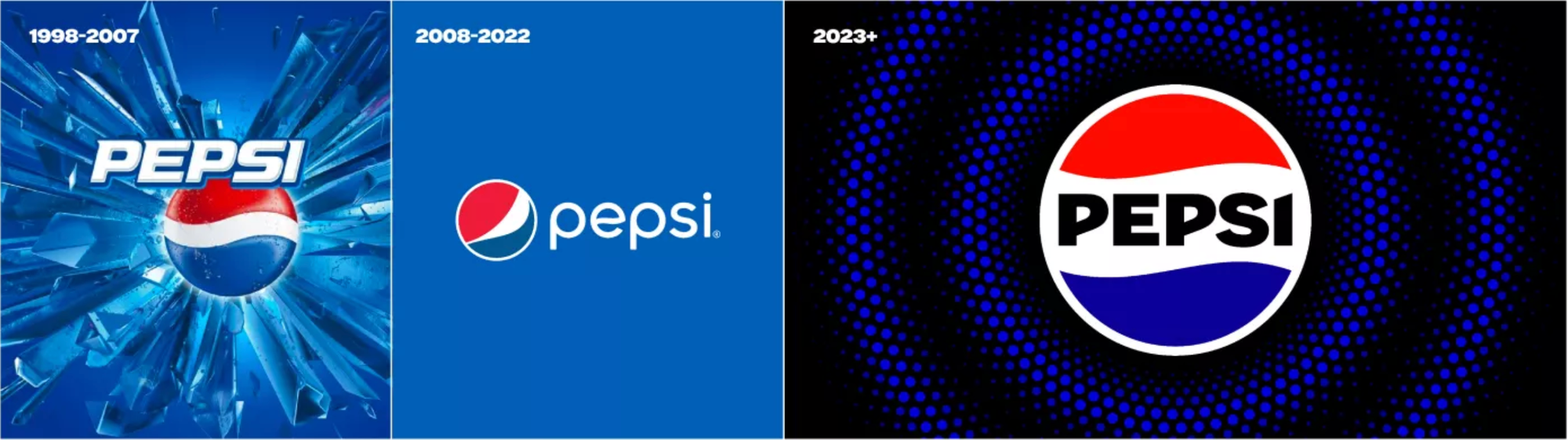
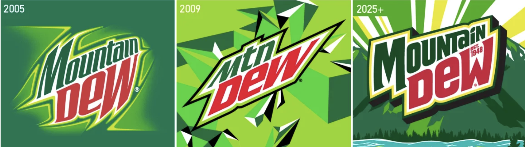
Two recent major product re-brands that reversed the extreme abstract-minimalism trend in the logos
Pepsi and Mountain Dew are not the only ones, but perhaps are two of the most recognizable. While the design trends are changing, it doesn't mean minimalism is fully going away. There are just more cases of minimalism being used in moderation to achieve an appropriate balance between maintaining the organization's identity and making the logo as versatile as possible. The 2022 Kids Help Phone brand however is steeped in the early minimal design trend which prioritized minimalism over everything else, even when it made no real sense for an organization to portray itself as a clean, corporate, minimal entity.
Unless the organization had reliable data showing that some aspect of either of their older brands were driving kids away from using the service, there is no reason for the re-brand other than the mindset that all organizations should re-brand on a regular basis. While there are plenty of reasons to have a regular brand refresh to create new design styles for social media posts and to keep up with changes to requirements or capabilities of web and social media technology, I've never come across a reason for scrapping your entire logo and identity outside of either an unrelated organization-wide reset (due to scandal, crisis, or otherwise) or to respond to strong data showing that people strongly dislike or distrust your brand as-is.

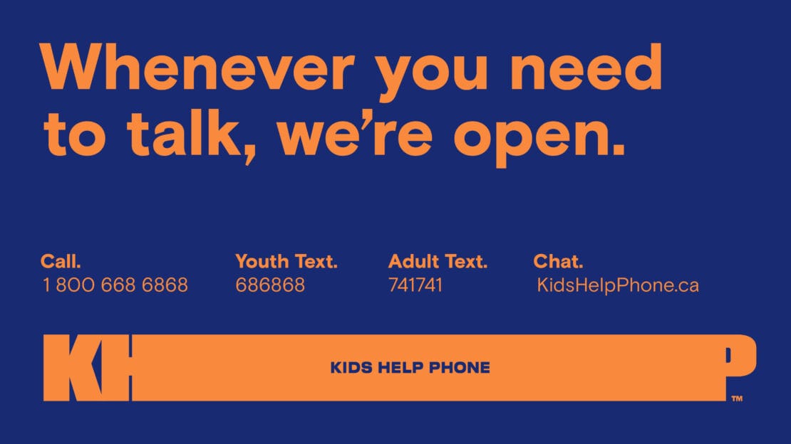
Two new posters from the 2022 redesign along with one of the old-school designs pre-2017
Given what I see and what little information exists online, I have to conclude that this was yet another corporate make-work project, with the actual goal being either to boost someone's portfolio / resume or as a very surface level way to distract from deeper concerns within the company. This is far from a unique story, but as a former youth-in-crisis that relied on services like the Kids Help Phone more than once to stay alive there is a personal element that frustrates me.
Ethics in Marketing
As part of my Professional Communication degree I took a course about "Professional Practice" taught by Dr. Yukari Seko and one of her lessons in particular stuck with me. We were talking about ethics and standards for those working in the communication field and she brought up the fact that many professions, especially ones that have an impact on people's quality of life (doctors, lawyers, etc.) have organizations that professionals in the field must register with. The organizations enforce standards and guidelines to ensure that people are not abusing or misusing their skills in the field to cause harm.
Despite being in the so-called information age where we can see propaganda and misinformation not only spread rapidly online, but be platformed by incredibly influential people to the point of causing violent coup attempts, there is no professional practice organization or association for those working in marketing, PR, or any kind of communication roles. So she impressed upon the class that it falls to each of us as individuals to ensure that we operate with strong morals and ethics when working, because it can be very easy to use our skills to cause harm.
I'll take "corporate designs with zero personality for 200 Alex"
While I don't think an unnecessary re-brand is causing massive harm by any means, the wasted money and effort on this pointless exercise could have gone to supporting more people in need. It does make me wonder if anyone involved in the design process brought up any concerns that doing such a minimal re-brand for a mental health non-profit might result not only in becoming just another corporate graphic among the deluge of advertisements that fill everyone's screens, but also could present a less inviting or comforting identity for the organization. Did no one think if it is a good idea for Kids Help Phone's graphics to be indistinguishable from ads for a bank or charli XCX's new album?
I also wonder if anyone stopped to consider the points I mentioned earlier about traditional KPIs not being relevant in this context, or if everyone just followed the textbook approach with no question or care for how it would impact people.
In a difficult-to-read interview with the Chief Creative Officer of McCann Canada, they talk about many of the high-level ideas behind the re-brand with seemingly zero consideration for the importance or seriousness that the youth mental health crisis deserves. Everything about it tells me the marketing team was just excited to have such a high-profile client that they could brag about. The following quote fully illustrates the lack of care the team seems to have put into the actual human beings, the at-risk children, that rely on Kids Help Phone:
Icons like that are also time-stamped, so right away, it felt dated and old to us - which was probably how it felt to a lot of kids out there.
Putting aside the fact that the "dated and old" logo being referred to was a chat bubble - the most common way messages appear on every device I've ever seen - they seem to fully admit they did no audience research. To say that the target audience "probably" felt the same way as the executives at a marketing agency felt is so out of touch it would be laughable if the issue at hand wasn't teenage suicide prevention. The final questions of the interview however, found a way to top even that – when he was asked about the re-brand was being received he responded with:
So far, so good! We know how tough it can be to impress the design community, but the feedback has been really positive.
Again, zero mention of people that would work closely with Kids Help Phone like mental-health providers and educators, and nothing about the audience itself: youth facing mental health challenges. There are so many things that could be considered in a well-intentioned re-brand effort for Kids Help Phone, from how to make the brand feel inviting to someone in crisis to exploring ways to make branded resources discreet in case kids need or want to hide it from their friends, or even abusive family members. Even the low hanging fruit of removing the word "phone" from the organization's brand name doesn't come up. I found no reference anywhere to these aspects or anything similar being considered, and the final product certainly suggests the only motivation was to impress the marketing world.


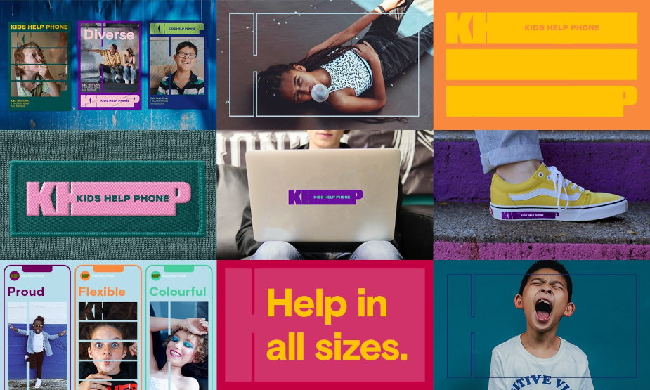
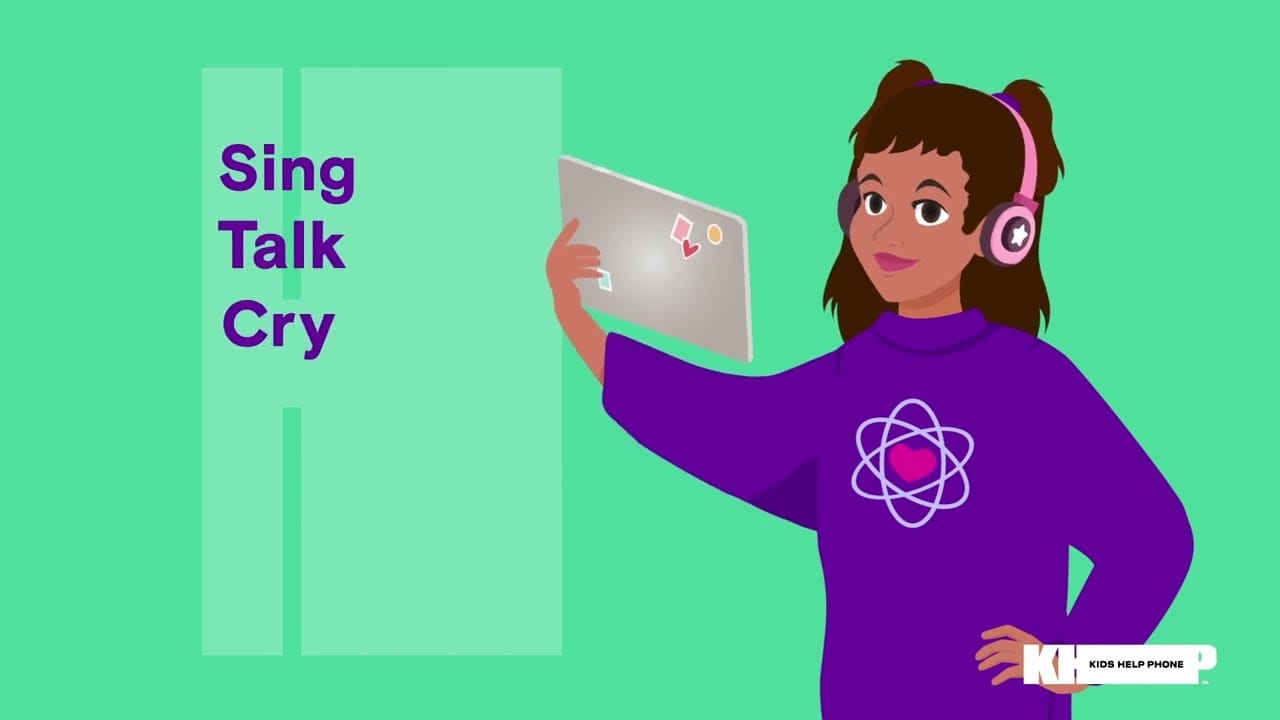
More corporate-minimalist designs used across social media, post-2022 re-brand
If I had to point fingers, I would probably still ultimately place the blame on leadership at Kids Help Phone for starting this process in the first place – especially given the robotic and meaningless responses provided by their CEO in interviews after the re-brand (strategyonline.ca).
As a communications professional however, the main take away for me from this is a feeling of great disappointment with my peers. It does not seem like anyone involved considered their ethical obligation as communication professionals to place the needs of the client / audience over their own desire for recognition and prestige. This only increases my concern that began when Dr. Seko spoke about the lack of ethical guidelines and enforcement in this field
Unless the Chief Creative Officer was uninvolved in the project and just provided their standard marketing responses to an interview and didn't think much of it, that interview exposes how the entire re-branding was nothing more than a shameful self-promotion exercise that extremely successful executives convinced a well known and trusted mental health non-profit it needed to undertake.
I would love nothing more than someone to respond to this post with data showing that youth are yearning for more minimal, soulless designs in the media they are consuming. If there are studies that show the best way to get through to kids on difficult or intense topics is to make them appear as similar to advertising as possible, I'd love to read them. I won't hold my breath though, since in my 7+ years of marketing and communications experience and in my research for writing this I've yet to find anything suggesting that to be the case. Regardless, none of the reasons given by McCann had any mention of data showing their approach would improve outreach or brand recognition and trust with youth.
Conclusion
I want to end on a positive note, but I have nothing positive to say about the re-brand, as you can likely tell if you've read this far. Instead I'll use the end here to encourage any marketing or communication professionals out there to do better.
Of course there are always considerations and circumstances that affect your ability to do this, but when you're given a design project that you have legitimate concerns about – bring them up. If your boss is so fragile that they can't hear feedback or suggestions from you, you aren't going to last long there anyway. What is the point of living if you don't get to actually have a say in what you work on every day until you're a grumpy middle-aged mid-level manager that suffered under superiors for years, or even decades.
If you go about it in a polite and constructive way, there's a good chance you will at least make your boss reconsider a bad approach to a design project. Especially when its related to something that has a high impact on an audience, like mental health, I would argue we have the ethical obligation to at the very least raise concerns that we see. Get your coworkers on your side first if you're nervous and approach the decision makers as a collective, that makes it harder to be ignored or wrongfully reprimanded.
A lot of the time we work on things that are frivolous, fun, or even silly – but when we do have the privilege of working on messaging, designs, or any type of media for a project that touches on critical or sensitive topics to any group of people, we have to do better.
Sources